In this blog, we will learn how to add a new custom action item to the component toolbar.
To extend or customize the component action toolbar, at a high level we need to do the following:
- Create a component for the custom action
- Overlay the toolbar from WCM
- Add a custom action item node
- Implement client library (javascript) to handle the click on the action
Step 1 – Create a component for the custom action
First of all we need to create a component for the custom action item. This component will be shown or popup when you click on your custom action.
For example, let’s create a custom action component here: /apps/<your-project>/components/actions/myaction
myaction.html
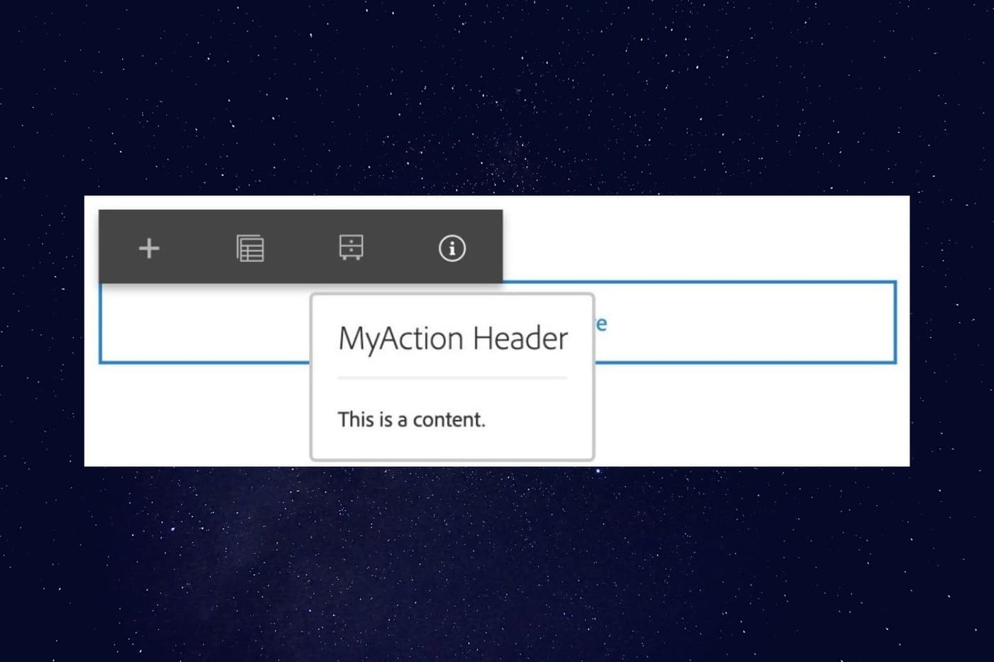
<coral-popover placement="bottom" id="demoButton">
<coral-popover-header?>MyAction Header </coral-popover-header>
<coral-popover-content?><p class="u-coral-margin"?>This is a content. </p></coral-popover-content>
</coral-popover>
Notice the above code snippet, we have defined the id for the custom Action item which will be used in the Javascript later to target.
Step 2 – Overlay the toolbar from WCM.
/libs/wcm/core/content/editor/jcr:content/content/items/content/content/items
Create an overlay using the Overlay Node option.
ath: /libs/wcm/core/content/editor/jcr:content/content/items/content/content/items
Overlay Location: /apps/
Match Node Types: active (select the checkbox)
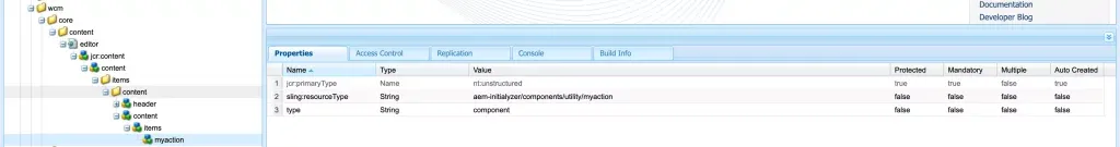
Step 3 – Add a custom action item node
For our example, we will create a custom toolbar button MyAction.
Create a new node under the overlaid node for example: /apps/wcm/core/content/editor/jcr:content/content/items/content/content/items/myaction and add the below mentioned properties.
sling:resourceType = "/apps/<your-project>/components/actions/myaction"
type = component
Step 4 – Implement clientlibrary for the custom action
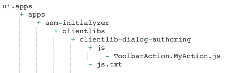
Now that we have the custom action item and the component ready, let’s create a new clientlibrary under your project for e.g. clientlib-dialog-authoring with category: cq.authoring.editor.sites.page.hook
Create a new JavaScript file in the js folder, for e.g. ToolbarAction.MyAction.js and make sure you include the same in the js.txt.
The folder structure for the clientlibrary might look like below.
(function ($, ns, channel, window) {
    "use strict";
    var popover;
    var EditorFrame = ns.EditorFrame;
    var ACTION_ICON = "coral-Icon--info";
    var ACTION_TITLE = "My Action";
    var ACTION_NAME = "MYACTION";

   /**
    * Represents the MYACTION action (opens a popover relative to the toolbar of the selected editable) that could be performed on the current {@link Granite.author.Editable}
    *
    * @memberOf Granite.author.edit.ToolbarActions
    * @type Granite.author.ui.ToolbarAction
    * @alias MYACTION
    */

    var MyCustomAction = new ns.ui.ToolbarAction ({
        name: ACTION_NAME,
        text: Granite.I18n.get(ACTION_TITLE),
        icon: ACTION_ICON,
        render: function ($el) {
            if (popover) {
                popover.target = $el[0];
            }
            return $el;
        },
        execute: function () {
            // just ensure we don't close the toolbar
            return false;
        },
        condition: function (editable) {
            return !!(editable && editable.dom);
        },
        isNonMulti: true
    });

    channel.on('cq-layer-activated', function(event) {
        popover = document.getElementById('demoButton');
        if (event.layer === "Edit") {
            EditorFrame.editableToolbar.registerAction(ACTION_NAME, MyCustomAction);
        }
    });

}(jQuery, Granite.author, jQuery(document), this));
In the above Javascript, the ACTION_ICON is set to Info icon. We can chose our own action icon from a set of predefined icon here. For more details on the Toolbar Action library, refer here.
Now, open up your page editor and select any component to bring up the component toolbar. You should see your custom action icon.
Advance User Tips
- You can use the condition block in the javascript to control when your button is shown
- You can also provide styles css for your popover component
I hope this tutorial is useful. If you want to check out how we can simplify the process of extending the core component, check out the blog: Spice up your Sling Model with Lombok.
At Initialyze, we have experience in customizing Adobe Experience Manager to meet the needs of your business. Are you looking to add special custom actions to your AEM components? Contact, Call or email us now to schedule a demo and learn how.